Friday, 24 October 2014

Empire Public Enemies Magazine Analysis


What can you say about the layout design (fonts, colour scheme)?
The colour scheme uses grey, red and white. This could have been done in order to highlight the importance of red. Which could connote to blood and murder which relates to the genre. In terms of layout a very basic one is used with the main headline being in the middle and the sell lines on a side in a box, there’s also a button promoting ghost busters and a banner.

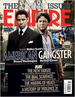
What can you say about the image?
It’s a still from the movie with the main character of Johnny Depp’s character, he conforms to the conventions of a gangster film by wearing a typical gangster outfit from the past and without even reading about it we know it’s a gangster film. Also the use of a tommy gun symbolizes that it’s a violent movie.

What can you say about the sell lines?
I like the idea of putting the sell lines in a box which makes them stand out more.  Empire is a magazine which focuses on sci-fi and fantasy films and that’s why the films included are Robin Hood, Iron Man 2 and Clash of Titans/  

What genre of film does it cover?
It’s a mix of both gangster and sci-fi movies although the main headline focuses on a gangster film it’s not a gangster specific genre.

Who is the target audience?
It’s most likely adult male audience as they are the most likely to watch crime movies. This genre appeals more to males because of the guns and the action, they are more likely to see it because of the brutality of the genre. There isn’t an age limit as older people may be more interested in these films which are based on a particular period in time.

Empire American Gangster Magazine Analysis


What is the name of the magazine? Why do you think it is called that?
The magazine is called Empire possibly because of the popularity of the magazine, it’s published in many countries around the world mainly in US and UK, and the readership of the magazine could be called its “empire” due to the size of this large number of readers.

What can you say about the layout design (fonts, colour scheme)?
The colour scheme is relatively dark the use of colours such as blue and red the connotation of this could be police, this is a convention of all gangster films as they need to show that crime is fought with law.  A unique feature of this magazine is layout. Instead of the sell lines being on the sides of the magazine framing the main image, they are in the centre bottom area of the cover which leads your eyes to the sell lines after reading the headline in order to get the audience interested in this issue. This also makes the audience focus more on the image.

What can you say about the sell lines?
Due to the fact that this is a 'crime issue' the sell lines are features on other crime related films including films such as Fargo, No Country for Old Men, Scarface and Eastern Promises.

What genre of film does it cover?
As this is the crime issue, all of the features relate to crime and the appropriate sub-genres

Who is the target audience?
It’s most likely adult male audience as they are the most likely to watch crime movies. This genre appeals more to males because of the guns and the action, they are more likely to see it because of the brutality of the genre. There isn’t an age limit as older people may be more interested in these films which are based on a particular period in time.

What is the magazine's mission statement or slogan?
'The World's Biggest Movie Magazine' which relates to the name of the magazine “empire”

Thursday, 16 October 2014

Poster Analysis 2 " Scarface (1983)"


Poster Analysis 1 "The Untouchables (1987)"


This poster must have been made from at least two images which were put together. Straight away you can see that the main antagonist is the character in the background. His dominance is shown through him being a much larger character comparing to others. He conforms to the conventions of a typical gangster character. This is seen through the use of his clothing, he is wearing a suit and a fedora as well as tinted glasses and a big diamond ring suggesting that he is a wealthy mafia boss. He is overlooking the other characters almost as if he is their god, this suggests that he hold control over the situation. This is contrasted to the bottom image which is much smaller and shows the other side of the situation possibly the protagonists who are trying to take the main boss out. We can see that they are also dressed in suits and they are holding guns. The main character stands at the front aiming his gun while his support can be seen by his side. The poster also tells us that there is a difference between the two sides through the use of color. The top image is black and white where as the bottom image is in color. The poster also follows all of the conventions of a typical film poster, this includes: large bold title (which is the biggest font on the poster) names of actors, directors a tagline, as well a production company logo, An unusual aspect found on this poster is the two blocks of text in the top right corner and just below it. I found this to be very usual however the film dates back to 1987 which could explain the reason behind this usual layout.  

Monday, 13 October 2014

Film Analysis: The Departed


The Departed is a 2006 American crime drama film directed by Martin Scorsese and written by William Monahan. It is a remake of the 2002 Hong Kong film Infernal Affairs. The film stars Leonardo DiCaprio, Matt Damon, Jack Nicholson, and Mark Wahlberg, with Martin Sheen, Ray Winstone, Vera Farmiga, Anthony Anderson, and Alec Baldwin in supporting roles.
The film “The Departed” is film about an undercover state cop who has infiltrated an Irish gang and a mole in the police force working for the same mob race to track down and identify each other before being exposed to the enemy, after both sides realize their outfit has a rat.
Although not all of the gangster movie conventions are shown in this film, many are still present. This is because it’s a modern gangster film. There are enough conventions used to tell us that we’re watching a gangster film. For instance the character “Frank Costello” is a notorious criminal; he is also a leader of the Irish mafia. He supports the conventions of a gangster film by showing no remorse for his actions he would do anything to get what he wants even if it could potentially harm someone.


In this scene we are introduced to the boss, we can tell that he is powerful and has lots of respect. For instance, the lighting is dark which connotes to being mysterious; this alternatively could mean that he is doing illegal business that he doesn't want anyone to find out about. It’s also a low angle shot showing us that he has superiority over others who have to look up to him. 


Probably one of the most recognizable scenes from the movie is this two shot when Leonardo DiCaprio smashes a glass on this man’s head after he taunts him on his selection of drink, not only because he waits to do it, he does it without saying a word. This scene also shows that the movie supports the conventions of a gangster movie through the use of location. Many of the films scenes are taken in this bar. It’s a place where all the mobsters go to meet their boss and have their business meetings


This is contrasted by the scenes in the office, which also play an important role in this movie. The link between the two suggests that both sides have similarities and “when you’re standing in front of a gun, what’s the difference?” and although the setting is different it supports the convention of a gangster film, because all gangster films must contain at least some way of fighting the crime, this could be through the use of police or inspectors. 


The mise en scene must also include some sort of weapons. Most gangster movies contain guns because they are the most effective weapons to use; this isn’t however limited to only guns, as weapons such as baseball bats and crowbars could also be used.


Thursday, 2 October 2014

Group Profile


This is our group profile which consists of Favour (left), Farida (centre) and Filip (right). We are known as 'F Studios'.


Favour is the costume and props director. His role includes organizing the miss-en-scene and making sure it's appropriate to our trailer as well as providing fitting locations, as well as organizing the filming in those particular locations if permission is required before hand


Farida is the director of cinematography. This role consists of supervising the actors and staff in the film to ensure the shots that  taken are well-suited for our trailer. She will be in charge of the cameraman job and will instruct him what sort of shot they should take from what angle, under what lighting etc.


Where as I'm the head editor. I will provide the essential editing for our trailer and will aid and oversee any editing made by staff. My role involves picking sound that will give the desired effect and putting together the shots considering certain aspects such as continuity and flow of the trailer in order to make it as professional as possible.

The Departed trailer analysis


The Departed (2006)


Similarly to “Gangster Squad” the opening sequence of the trailer beings with the introduction of the main antagonist character. The Departed shows a silhouette of the villain due to the dark lighting walking and narrating the story, we also see him smoke. This is underplayed with a slow and relaxing track suggesting that he is calm and has nothing to worry about.  The following shots include the introduction of two other characters a cop and a criminal.  Mise en scene used includes the cop wearing a badge and being in uniform, the criminal working out in jail and being “tough” as well as a shot of a gun which could be linked to both sides.  “when you face a loaded gun what’s the difference” the main antagonist says this with the implication of blending the roles of cops and criminals suggesting that they have a lot in common, in this shot, the face of the villain is also revealed in a close up.  This is also when a production logo is showing; following a change of pace showing a scene of the police department more mise en scene is included as we can see a police station. This is where we see a link between the two main characters and how one of them becomes an inspector in the elite unit while the other becomes an undercover agent.  This follows a montage of scenes of the cop working undercover as a gangster. The music also changes to traditional Irish music; this was done to show that the gang is from an Irish origin. That’s also where we find the plot twist of the story and find out that there is people working undercover for both sides. This also works well with the change of music that turns into very dramatic and deep orchestra music  Other mise en scene also includes locations such as bars for the gangsters and office’s for the police men. In the final section of the trailer the song changes to “Comfortably Numb” by Van Morrison (a cover of a song by Pink Floyd) which in my opinion ruins the flow of the trailer, however the continuity is established by the complex story line which includes the characters struggling to cope with their undercover identity. Followed by a sequence of action shots in form of a montage showing the most exiting parts of the movie which suggests that it also has some action film conventions, which is also similar to the movie “Gangster Squad”

Gangster Squad trailer analysis


Gangster Squad (2013) 


The trailer begins with a establishing shot which pans over Hollywood telling us that the film is set in L.A. following a scene which establishes who the main antagonist is. It shows us a scene where the main boss is being ruthless and has no mercy on his enemies. Following a short scene where we can see him killing a person as well as setting barrels on fire. Suggesting that he will do anything to get his point across, in the following scene we see Ryan Gosling’s character say “This is Mickey Cohens town, you’re not going to change anything around here Sgt” this line tells us the basic goal of the films protagonists. Followed by logos of the producing companies; this is done to advertise the companies who made the film this convention are seen is any blockbuster movie. This also when the pace of the trailer changes. In the next several seconds we get to see more conventions of a gangster movie, some of these conventions include the use of guns, gambling in casinos as well as being in a bar/lounge. The subsequent scene introduces the protagonists; some of the mise en scene includes the characters being dressed professionally in suits as well as fedoras. You can also see that many of the characters smoke either cigars or cigarettes. The characters are introduced using close up shots of their faces, which clearly illustrates who is who. The story of the trailer clearly tells us that the policemen are working undercover in order to take down a notorious gangster. This can be seen the following shots where we see them preparing for the mission. This is also when the song “Oh My God” by Jay Z starts playing. I think that the song works well with the trailer as the shots become in sync with the beat. This creates continuity despite of the montage of shots. This also makes the trailer flow better, as the beat builds up so does the pace of the action in the trailer. We are then introduced to the love interest of one of the characters. The girl is wearing a red dress and appears to be rather seductive. The second section of the trailer appears to be high pace action with many gun shots and explosives which suggest that this film has lots of action in it. The gun shots also appear to be in sync with the music which also impacts on the continuity of the story.